The Rack View provides a simulated visual representation of a selected rack, including its devices, ports, and statuses. This view is populated using data from a PTP Excel file.
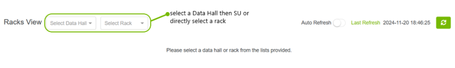
The page is initially blank, and user has 2 options:
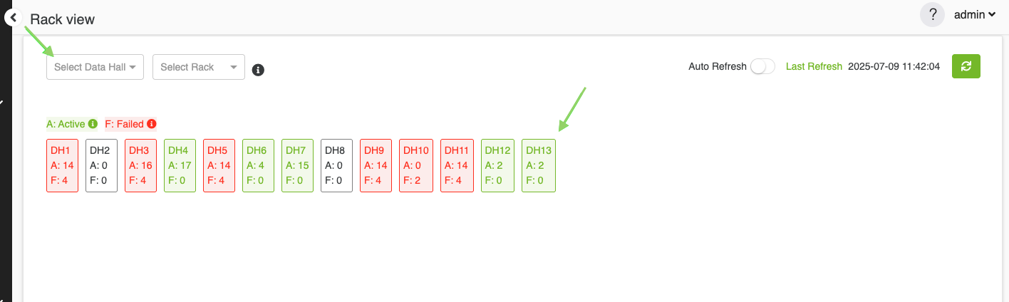
Hierarchical Selection Workflow
This hierarchical selection process allows users to navigate from a Data Hall to SU and then to specific Racks. This feature is only available if the user has provided the DC Floor Layout file while loading the P2P file. Below are the steps the user should follow:
-
Select a Data Hall: Begin by selecting a Data Hall from the dropdown menu or by clicking on one of the DH squares displayed below, which show the number of active and failed components within each Data Hall. This selection determines the scope of available Scalable Units and Racks.
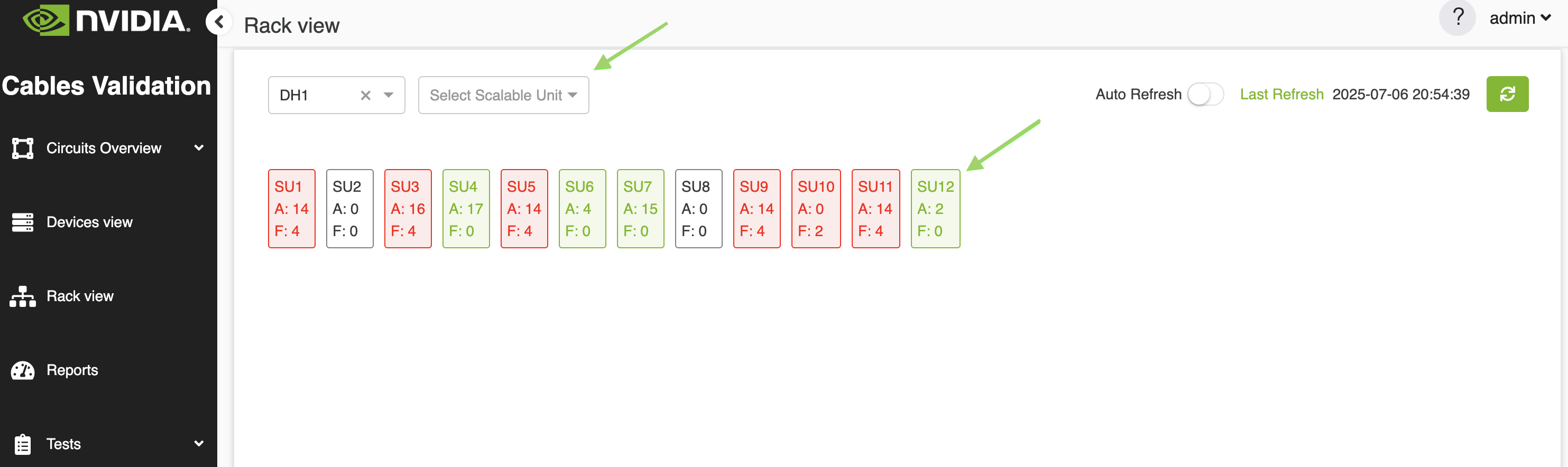
2. Display and Select SU: Once a Data Hall is selected, all associated Scalable Units (SUs) will be displayed in two forms:
-
-
Dropdown Menu – A list of available SUs for easy selection.
-
Visual Squares – Each square represents an SU and displays the number of active and failed components.
-
The user can either select an SU from the dropdown or click on one of the SU squares in the visual layout.
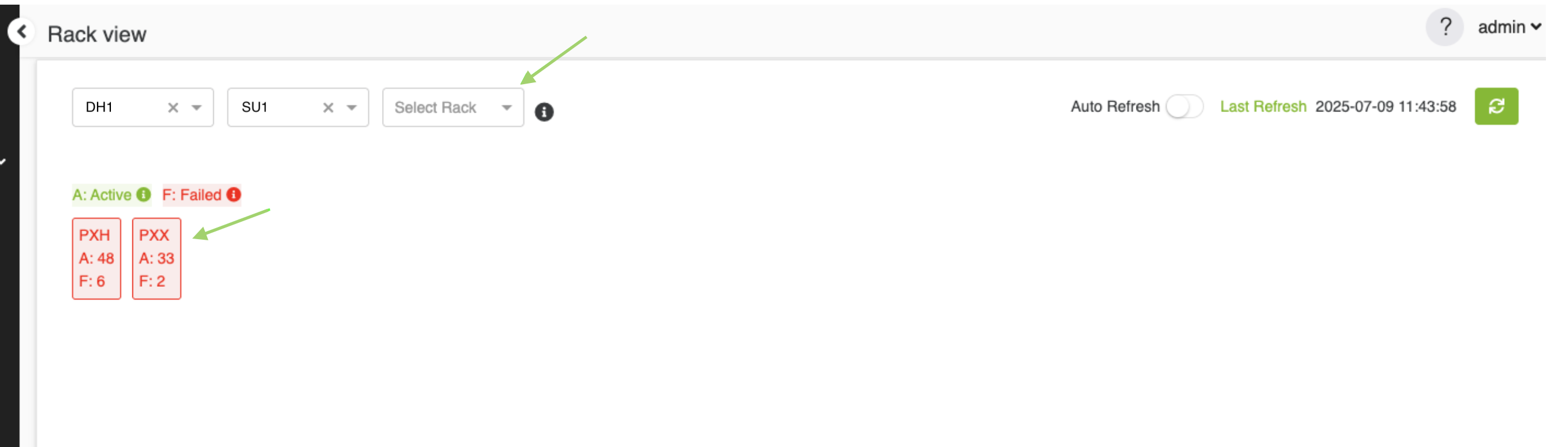
3. Display and Select Racks: the same as SU, after selecting an SU, all associated Racks within that SU will be displayed in two forms:
-
-
Dropdown Menu – A list of all racks within the selected SU.
-
Visual Squares – Each square represents a Rack and includes the number of active and failed components.
-
The user can either select a rack from the dropdown menu or click on a rack name to view the simulated visual representation of the selected rack.
Select a Rack Directly
If the DC Floor layout is not loaded, user can directly select a rack from the rack menu to see the simulated visual representation for it.
The rack menu will contain all racks recognized by the CVT tool.

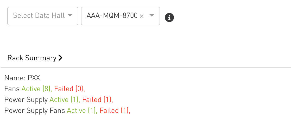
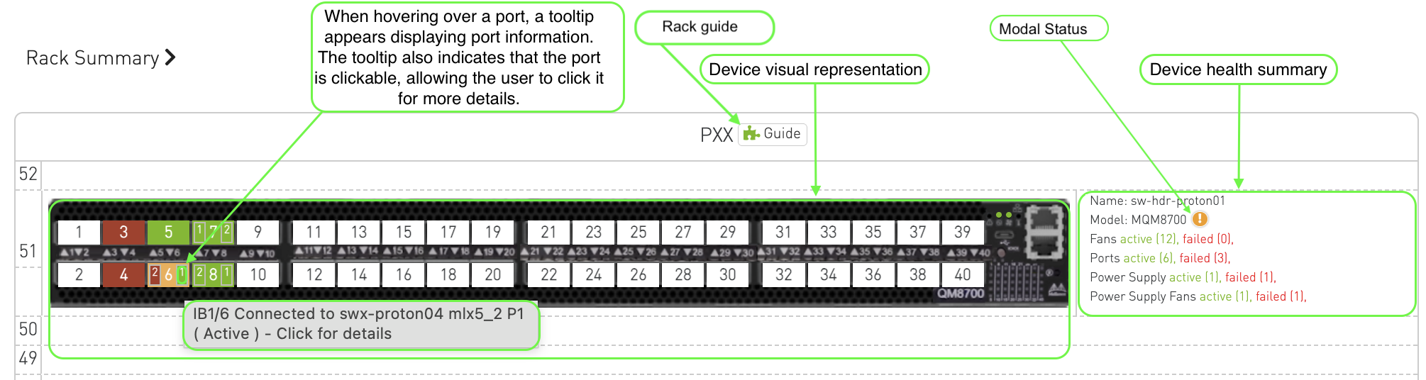
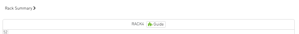
Rack-Level Summary
At the top of the view, an aggregated summary for the entire rack is displayed.
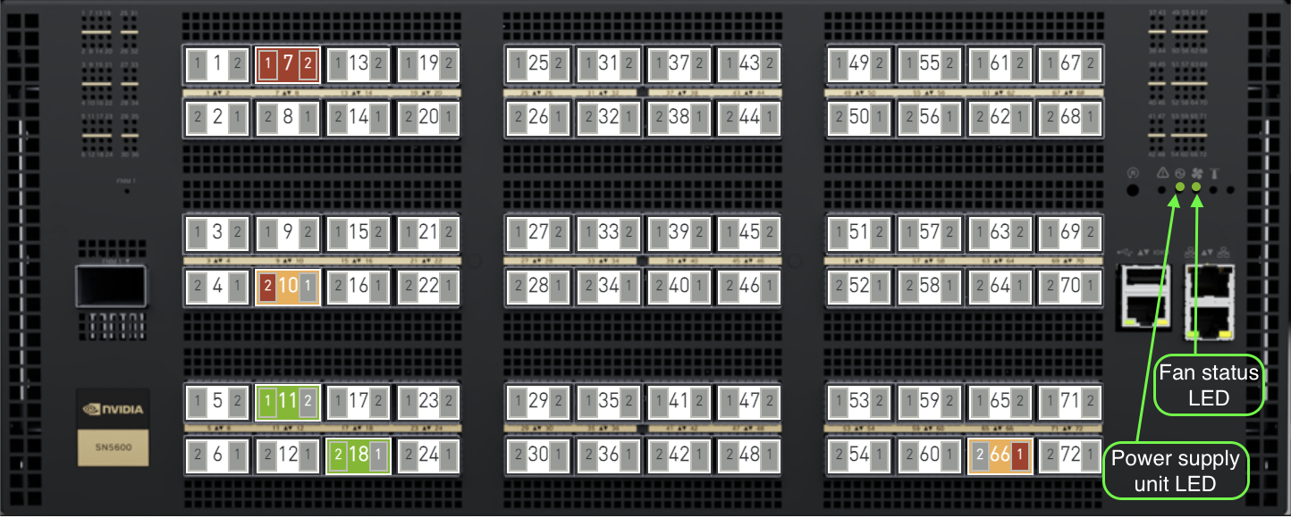
Front View
Once a rack is selected, the corresponding front view of the rack will be displayed.
The front view is the default Rack View and displays the forward-facing side of the rack.
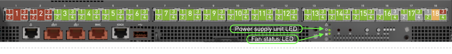
It shows all devices (switches, servers, and compute trays) mounted in the rack along with their physical port layout, port status coloring, status LEDs, and device summaries.
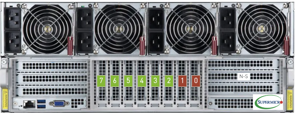
The tool support visualization for the following switches and hosts:
Ethernet
SN5600 SN5600D Switch
SN5610 Switch
SMC SuperServer
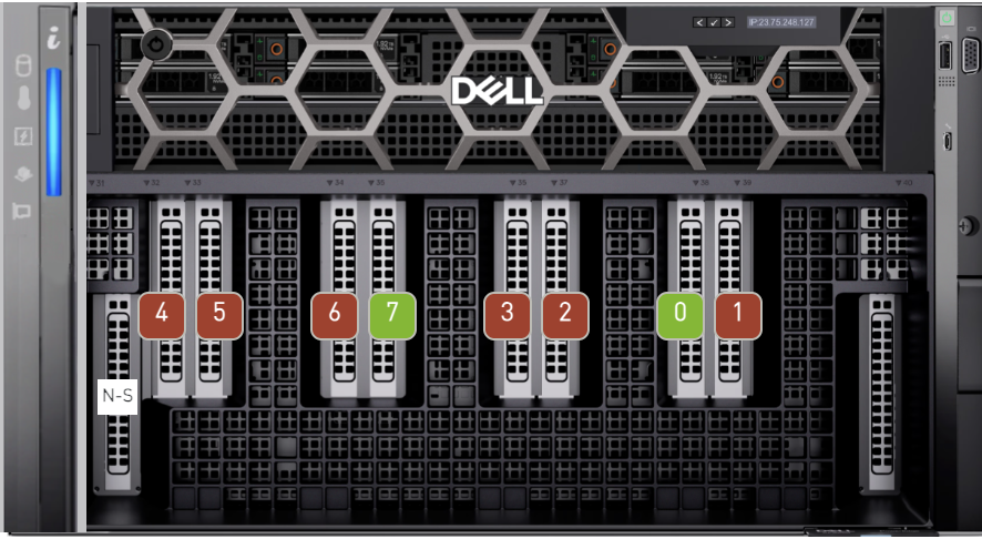
XE9680 Server
InfiniBand
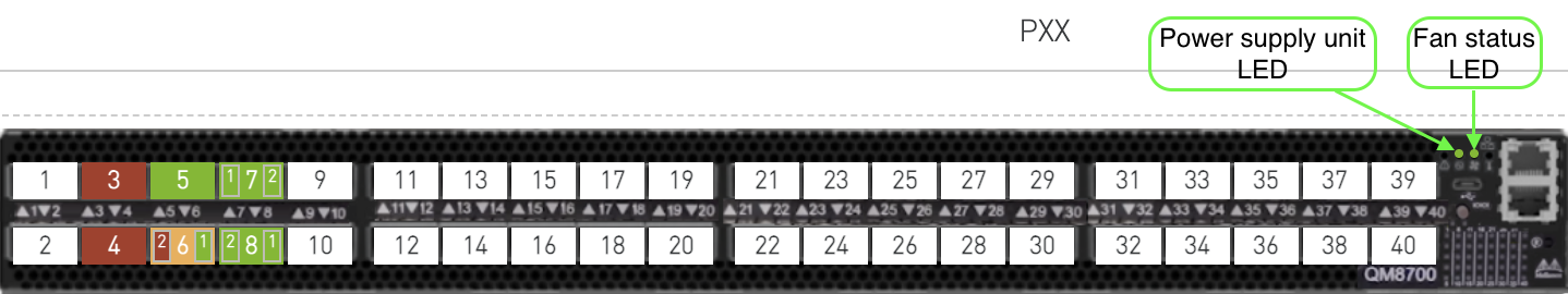
MQM8700 Switch
MQM9700 Switch
XDR
Quantum-3 XDR Switch
NVLink
Scaleout Switch
Non-Scaleout Switch
Non-Scaleout DGX Switch
HGX Compute Tray

DGX Compute Tray

Dell Server 9712a
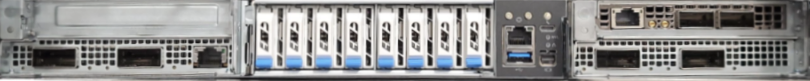
DGX-B300 Server
The DGX-B300 server visualization displays two port groups:
-
OSFP Ports — Up to 8 OSFP connector ports (ConnectX-8) arranged in a single row, with a spacing gap after every 4th port to match the physical layout of the device.
-
BlueField NIC Slots (Slot 1, Slot 2) — 2 BlueField NIC slot ports.
The DGX-B300 device occupies 10 rack units in the rack view.
Prerequisite: To view the DGX-B300 correctly in the Rack View, users must fill in the physicalPort column in the Server Profile sheet of the P2P file. Port names should follow the physical port naming convention (e.g., OSFP1 P1, OSFP5 P2, Slot 1 Port 1, Slot 2 Port 2).
Default
The default view is used to display devices that don't have a product name.
Default Host
Default Switch

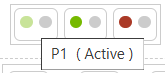
Port Status Coloring
Each port on the device is color-coded to visually represent its status, making it easier to identify and troubleshoot issues. The status of each port is indicated by the following colors:
Ports are color-coded based on their related issues:
-

-

-

-

Split Port Status
Split ports occur when a single physical port is divided into multiple logical ports. For example, in the BlackMamba switch, a single physical port may be divided into two logical ports, named sw<num>p1 and sw<num>p2.
The color-coding system for split ports follows these guidelines:
-
Uniform Status Across Logical Ports: If all logical ports of a split port share the same status, the coloring will match that of a non-split port.
-
Mixed Issues with Different Severities: If the logical ports have issues of varying severity, the background color will reflect highest severity.
-
Mixed Active and Issue States: If one or more logical ports have issues while others are active, the background color will be orange

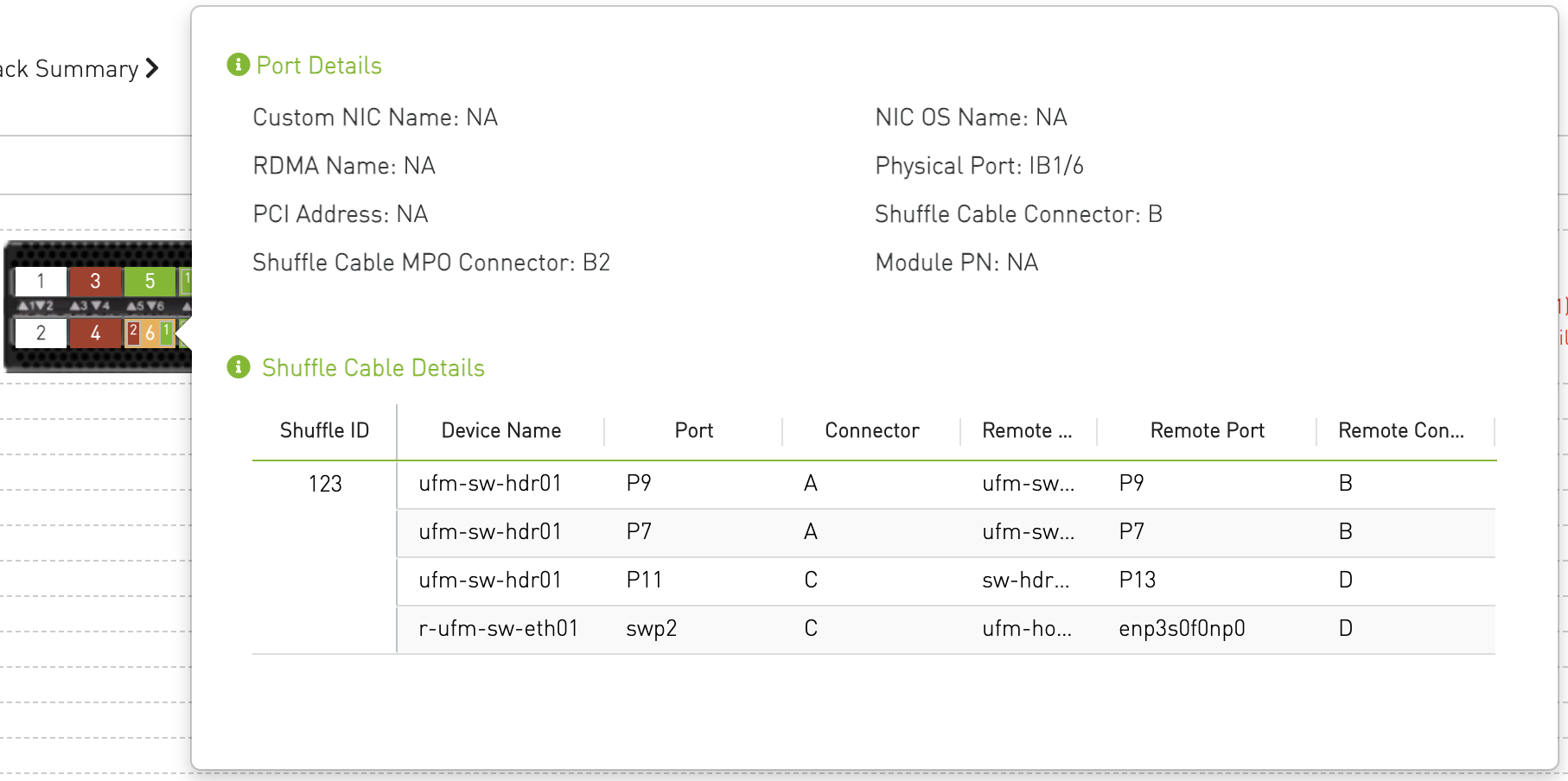
Port Details
When hovering over a port, a tooltip appears displaying:
-
Port-specific information
-
Details about the associated issue (if any)
-
An indication that the port is clickable
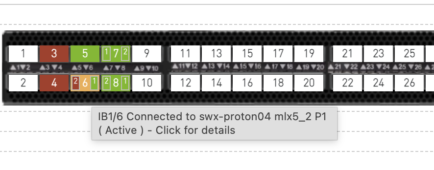
Clicking on a port opens a popover that displays detailed information about the selected port, including shuffle cable details (if available).
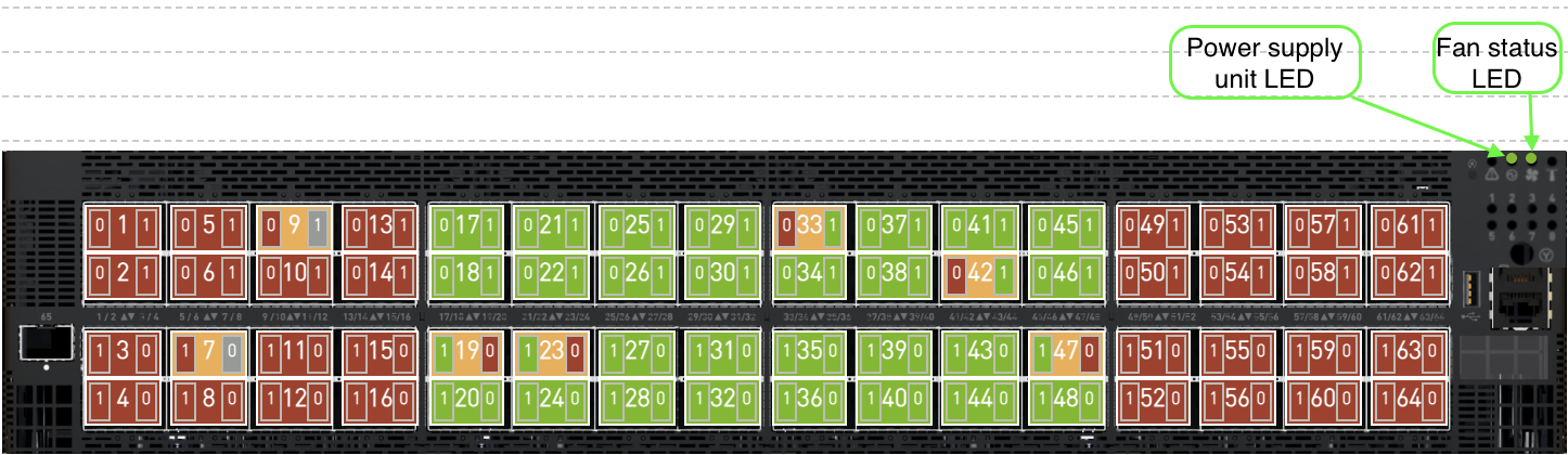
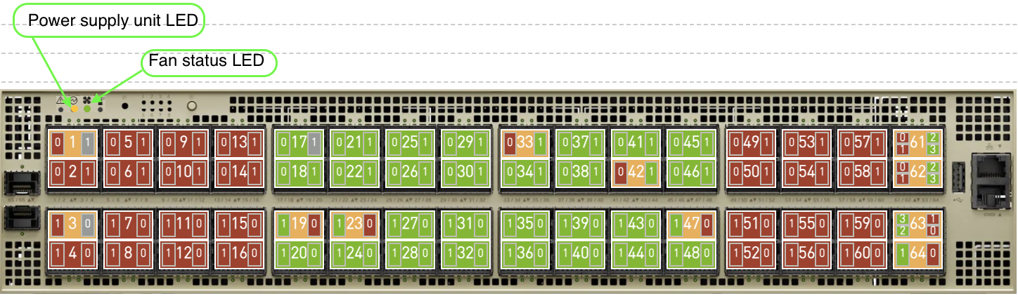
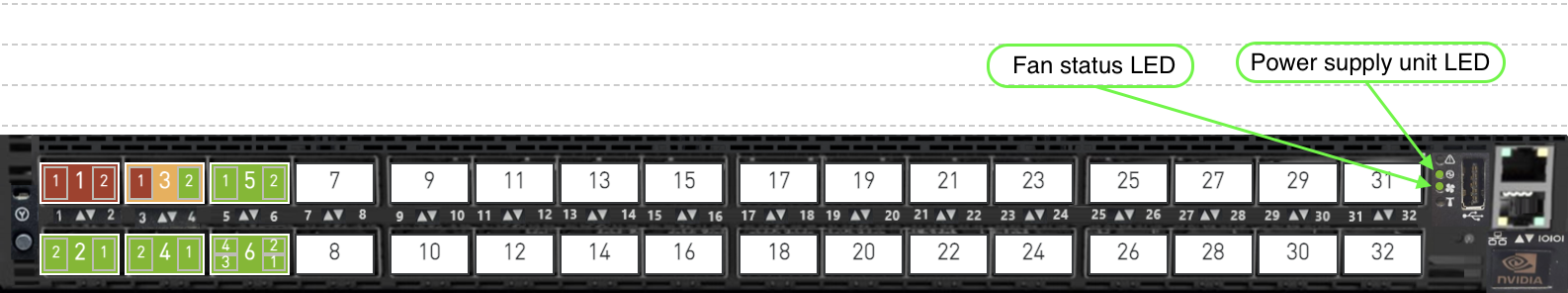
Status LEDs
|
Symbol |
Name |
Description |
Color |
|
|
Power Supply Unit LED |
Shows the health of the power supply units. |
Amber if fail, Green if everything ok |
|
|
Fan Status LED |
Shows the health of the fans |
Amber if fail, Green if everything ok |


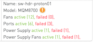
Device Summary
Beside each device in the rack, a summary panel provides an overview of its status, including:
-
Name
-
Model
-
Fans: Count of active and failed fans.
-
Ports: Count of active and failed ports.
-
Power Supplies: Count of operational and failed power supply units.
-
Power Supply Fans: Count of operational and failed power supply fans.
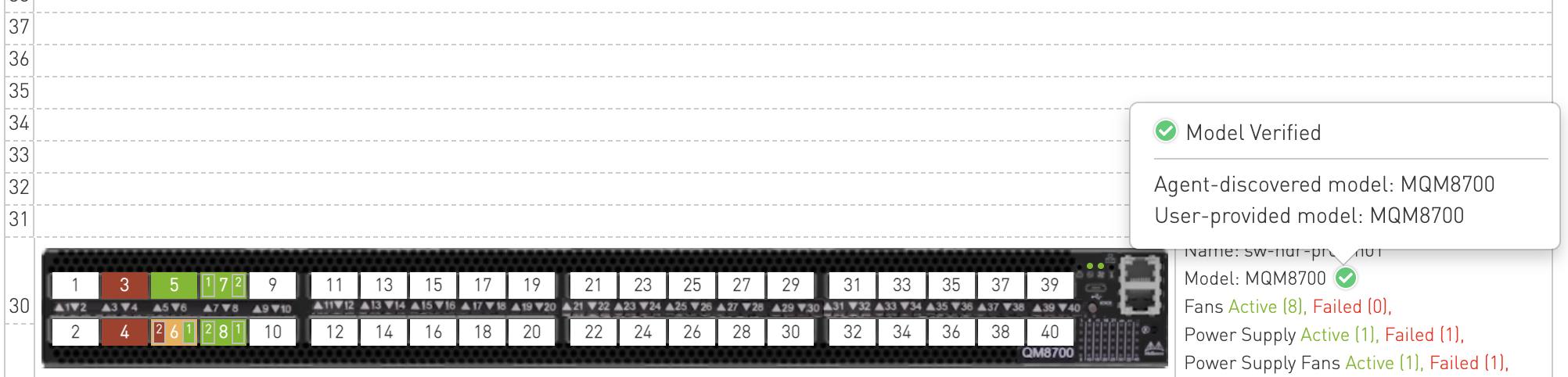
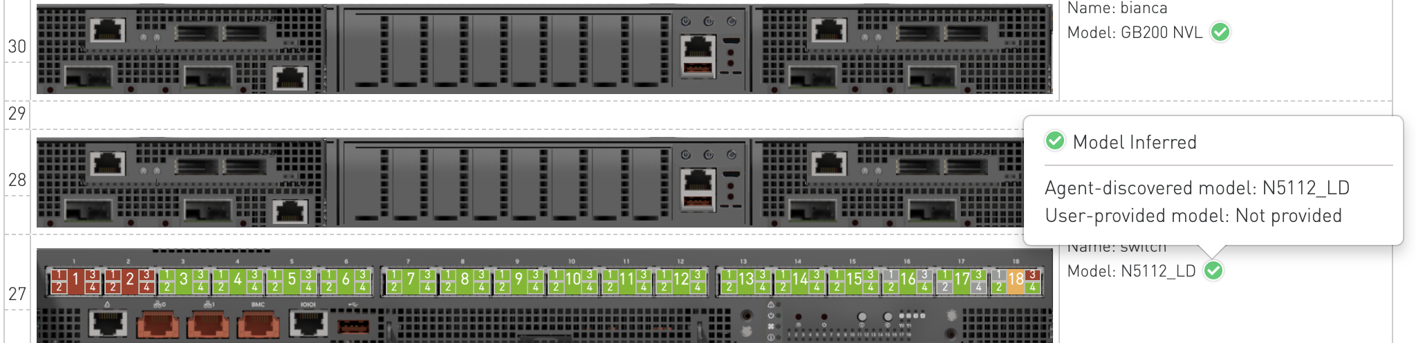
Device Model
The Device Summary displays device images based on the available device model information. The image selection logic uses data from both the system discovery process and the node_model field in the P2P file. Based on the availability and consistency of these values, the Rack View assigns a Model Status to each device.
Model Status Scenarios
-
Model Status: Verified
Displayed when both the agent-discovered model and the P2Pnode_modelvalue exist and match.
This indicates that the device model information has been successfully validated.
-
Model Status: Inferred
Displayed when only the agent-discovered model is available.
The device model is assumed based on system discovery data.
-
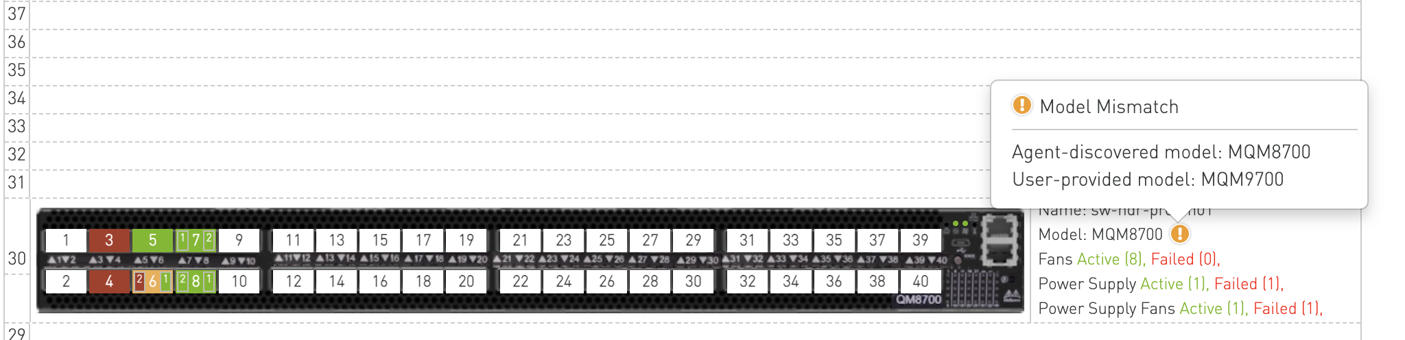
Model Status: Mismatch
Displayed when both the agent-discovered model and the P2Pnode_modelvalue exist but do not match.
This indicates a discrepancy that may require user review.
-
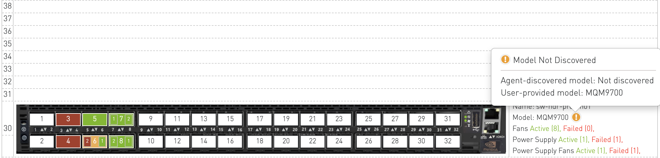
Model Status: Not Discovered
Displayed when only the P2Pnode_modelvalue is available and no agent-discovered data exists.
The device model is taken from the P2P file without system verification.
-
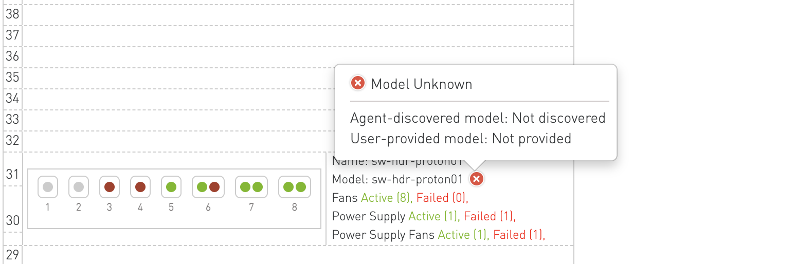
Model Status: Unknown
Displayed when neither the agent-discovered model nor the P2Pnode_modelvalue is available.
The device model cannot be determined.
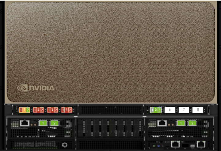
Front / Rear View Toggle
For supported rack types (currently GB200 NVLink racks), the Rack View provides both a front view and a rear view of the rack. A toggle button appears in the rack header when rear-view data is available.
-
Clicking the toggle button switches between the front view (device ports and cables) and the rear view (Cable Cartridge visualization).
-
The active view is persisted while navigating between racks of the same type.
-
For racks without rear-view data, the toggle button is hidden and the front view is shown by default.

Rear View — Cable Cartridge Visualization
The rear view displays the Cable Cartridge (CC) layout for racks. Cable Cartridges are physical components accessible from the rear of the rack that connect devices across rack units.
Availability
The rear view is available for the following rack types:
-
GB200 36x1
-
GB200 36x2
-
GB200 72x1
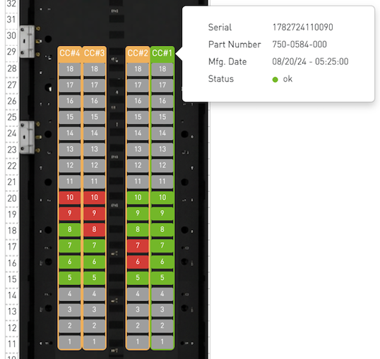
Cable Cartridge Layout
The rear view renders a background image of the rack's rear panel with Cable Cartridge columns overlaid. Each CC column (CC#1 through CC#4) shows the slot blocks corresponding to the devices (switches and computes) connected through that cartridge. Slot blocks are vertically aligned with the rack unit grid.
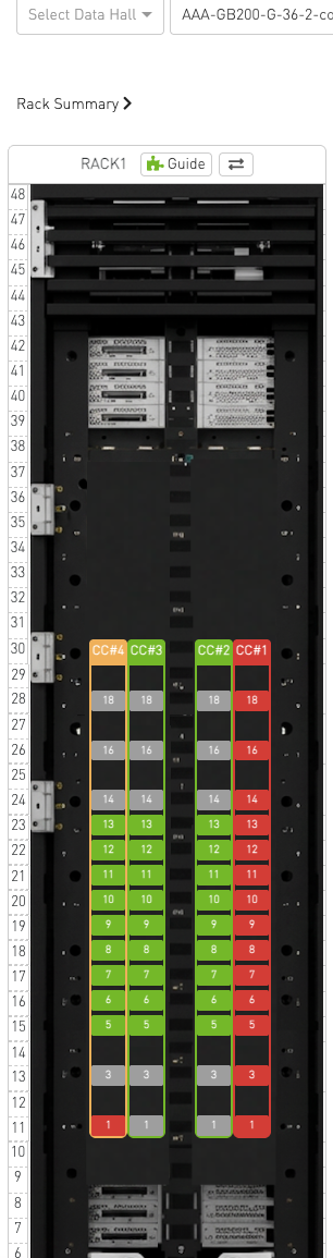
Cable Cartridge Status Coloring
Each cable cartridge and its individual slots are color-coded based on validation status:
|
Color |
Status |
Description |
|---|---|---|
|
Green |
ok |
All validations passed for this CC/slot. |
|
Red |
failed |
Validation has detected an issue (e.g., EEPROM read failure, bad CC). |
|
Orange |
partial_failure |
Some slots on this CC have failed while others are OK. |
|
Grey |
not_discovered |
No agent has reported data for this CC/slot yet. |
The status color is applied to the CC header, column border, and individual slot blocks.
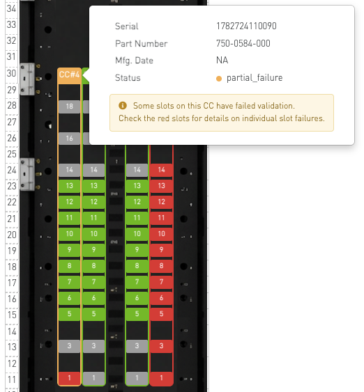
Cable Cartridge Details (CC-Level Popover)
Clicking on a CC header (e.g., "CC#1") opens a popover with cartridge-level details:
-
Serial — Cartridge serial number.
-
Part Number — Cartridge part number.
-
Mfg. Date — Manufacturing date.
-
Status — Current validation status (with color indicator).
-
Syndrome — Validation syndrome name (if any), e.g., CC-EEPROM-Misprogrammed, CC-Bad. Shown only when a syndrome is reported.
-
Description — Brief description of the issue. Shown only when available.
-
Recommended Actions — Numbered remediation steps. Shown only when available.
For partial_failure status, a warning note is displayed indicating that some slots have failed and the user should check the red-colored slots for individual failure details.
Slot-Level Details (Slot Popover)
Clicking on an individual slot block within a CC column opens a popover with device-level details:
-
Node — Device/node name.
-
Slot ID — Reported slot ID from the device EEPROM.
-
Expected Slot — Expected slot ID derived from the device's rack unit position. If there is a mismatch between the reported slot ID and the expected slot, the expected slot cell is highlighted in red with a mismatch note.
-
Tray ID — Reported tray ID.
-
Status — Slot-level validation status.
-
Syndrome — Slot-level syndrome (e.g., CC-EEPROM-Read-Failure). Shown only when a syndrome is reported.
-
Description — Brief description of the issue. Shown only when available.
-
Recommended Actions — Numbered remediation steps. Shown only when available.
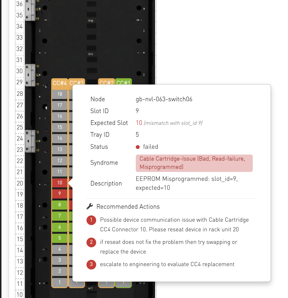
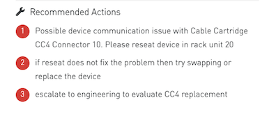
Recommended Actions
When a validation issue is detected, the popover displays a Recommended Actions section with numbered steps guiding the operator through remediation. These actions are generated by the Cable Cartridge validation engine based on the specific syndrome detected.
Rack Guide
The Rack Guide View helps users understand the rack visualization and port status indicators through an interactive modal guide.
It can be accessed by clicking the Rack Guide button in the Rack View, opening a user-friendly modal without leaving the current screen.
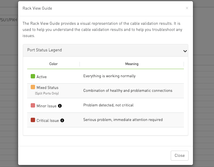
Interactive tooltips next to Minor and Critical issues provide detailed lists of specific problems.
Custom Device Configuration
The Rack View supports a user-extension device configuration file (devices-configuration.user.json) that allows users to add new device models or override existing built-in device visualizations without modifying the CVT source code.
How It Works
On startup, the Rack View loads the built-in device configurations and then loads the user-extension file. User-defined devices are merged into the built-in configuration:
-
New devices: Added to the Rack View automatically.
-
Existing devices: User entries override the built-in configuration for the same device key.
-
Merge scope: Only the
devicessection is merged into the built-in configuration. TheregexTemplatesandmodelAliasessections are used only to resolve references within the user-extension file itself and are not merged into the built-in configuration. -
Validation: The user-extension file is strictly validated on load. If the file contains errors (malformed JSON or invalid structure), it is skipped entirely and a toast notification is displayed with a description of the first error found. If the file is missing, the Rack View silently falls back to the built-in configuration without any notification. In both cases the Rack View continues to function with the built-in configuration only.
File Location
The user-extension file is located in the CVT bringup container at::
/opt/ufm/cablevalidation/media/assets/rack-configurations/devices-configuration.user.json
Configuration Schema
The file follows this JSON structure:
{
  "regexTemplates": {
    "<templateName>": "<regex pattern>"
  },
  "modelAliases": {
    "<aliasDeviceKey>": "<existingDeviceKey>"
  },
  "devices": {
    "<DEVICE_KEY>": {
      "deviceModel": "<string>",
      "rackUnits": <integer>,
      "frontView": {
        "backgroundImage": "<filename.png>",
        "styles": {
          "width": "<px>",
          "height": "<px>"
        },
        "portGroups": {
          "<groupId>": {
            "maxPorts": <integer>,
            "maxRows": <integer>,
            "reverseInterval": <integer>,
            "portRegex": "<regex or $templateRef>",
            "portStyleType": "normal | compressed-vertical | compressed-horizontal",
            "portNumberOffset": <integer>,
            "columnSpacing": [{ "interval": <integer>, "spacing": "<px>" }],
            "rowSpacing": [{ "interval": <integer>, "spacing": "<px>" }],
            "styles": {
              "container": { },
              "portColumn": { },
              "port": { },
              "splitPort": { }
            }
          }
        },
        "ledsGroups": {
          "<groupId>": {
            "backgroundImage": "<filename.png>",
            "maxRows": <integer>,
            "columnSpacing": [{ "interval": <integer>, "spacing": "<px>" }],
            "rowSpacing": [{ "interval": <integer>, "spacing": "<px>" }],
            "styles": {
              "container": { },
              "leds": { },
              "led": { }
            },
            "items": [
              { "title": "<string>", "healthKeys": ["<key1>", "<key2>"] }
            ]
          }
        }
      }
    }
  }
}
Field Reference
Top-Level Fields
|
Field |
Required |
Description |
|---|---|---|
|
|
No |
Reusable regex patterns that can be referenced in |
|
|
No |
Maps alias device keys to existing device keys, allowing multiple hardware variants to share a single configuration. |
|
|
No |
Map of device configurations keyed by device model identifier. |
Device Fields
|
Field |
Required |
Description |
|---|---|---|
|
|
Yes |
Device model identifier string (must match the model reported by the system or specified in the P2P file). |
|
|
No |
Number of rack units the device occupies. Defaults to 2 for switches, 1 for hosts. |
|
|
No |
Front-view layout configuration. Contains the visual layout for the front-facing side of the device. |
View Configuration Fields (frontView)
|
Field |
Required |
Description |
|---|---|---|
|
|
Yes |
Filename of the device background image (placed in |
|
|
Yes |
CSS styles for the device container (typically |
|
|
No |
Map of port group configurations (see below). |
|
|
No |
Map of LED group configurations (see below). |
Port Group Fields
|
Field |
Required |
Description |
|---|---|---|
|
|
Yes |
Maximum number of ports in the group. |
|
|
Yes |
Number of rows in the port layout. |
|
|
No |
Number of consecutive rows sharing the same reverse state. E.g., 1 = alternate every row, 2 = alternate every 2 rows. |
|
|
Yes |
Regex pattern (or array of patterns) with named capture groups |
|
|
No |
Port rendering style: |
|
|
No |
Offset to add to extracted port numbers (default: 0). Set to 1 for 0-indexed split numbering. |
|
|
No |
Array of spacing levels. Each entry has |
|
|
No |
Array of spacing levels for rows (same format as |
|
|
Yes |
CSS styles at four levels: |
LED Group Fields
|
Field |
Required |
Description |
|---|---|---|
|
|
No |
Optional background image for the LED panel. |
|
|
No |
Number of LED rows per column. Defaults to 1 (horizontal). Set to items.length for vertical. |
|
|
No |
Spacing between LED columns (same format as port group |
|
|
No |
Spacing between LED rows within a column (same format as port group |
|
|
Yes |
CSS styles at three levels: |
|
|
Yes |
Array of LED items (must be non-empty). Each item may include an optional |
Example
Below is an example configuration for the DGX-B300 server, which has two port groups (OSFP and BlueField) and occupies 10 rack units:
{
  "regexTemplates": {
    "osfp": "OSFP(?<port>\\d+)(?:\\s*P(?<s1>\\d+))?",
    "slot": "Slot\\s*(?<port>\\d+)(?:\\s*Port\\s*(?<s1>\\d+))?",
    "slashSeparatedPort": "[A-Za-z]+(?<port>\\d+)/(?<s1>\\d+)"
  },
  "modelAliases": {
  },
  "devices": {
    "DGXB300": {
      "deviceModel": "DGXB300",
      "rackUnits": 10,
      "frontView": {
        "backgroundImage": "dgx-b300.png",
        "styles": {
          "width": "724px",
          "height": "492px"
        },
        "portGroups": {
          "osfp": {
            "maxPorts": 8,
            "maxRows": 1,
            "portRegex": ["$osfp", "$slashSeparatedPort"],
            "columnSpacing": [
              { "interval": 4, "spacing": "245px" }
            ],
            "styles": {
              "container": { "top": "347px", "left": "61px" },
              "portColumn": { "width": "5.1%", "margin-right": "9px" },
              "splitPort": { "font-size": "12px" }
            }
          },
          "bluefield": {
            "maxPorts": 2,
            "maxRows": 1,
            "portRegex": "$slot",
            "columnSpacing": [
              { "interval": 1, "spacing": "370px" }
            ],
            "styles": {
              "container": { "bottom": "81px", "left": "120px" },
              "port": { "background-color": "transparent !important", "color": "transparent !important", "width": "78px" },
              "splitPort": { "font-size": "12px" }
            }
          }
        }
      }
    }
  }
}
Validation Rules
The user-extension file is validated on load. If any of the following conditions are not met, the entire file is skipped:
-
The file must be valid JSON.
-
deviceModelis required for each device. -
Within
frontView:backgroundImageandstylesare required.portGroupsandledsGroupsare optional. -
Each port group must have
maxPorts,maxRows,portRegex, andstyles. -
All
portRegexpatterns must be valid regular expressions. Template references ($templateName) must resolve to an entry in the same file'sregexTemplatessection (built-in templates are not available to the user-extension file). -
Spacing arrays must contain objects with
interval(integer) andspacing(string) fields. -
LED groups must have
stylesanditemsfields.
When validation fails, a toast notification is displayed with a description of the first error found.
Last updated: