Removing alert rules
Plugin Release Notes
Changes and New Features
|
Plugin Version |
Changes and New Features |
|---|---|
|
1.1.16 |
|
Bug Fixes
This plugin is supported on UFM Enterprise Appliance only.
Overview
The ClusterMinder plugin is an aggregator that consolidates telemetry from various endpoints into a UI and alerting engine, providing histogram views of numeric data with outlier detection, tree views of all collected data with anomaly detection based on grouping/clustering and heuristics-based suspected errors, telemetry graphs for incoming metrics, and a customizable alerting platform
The plugin can be deployed as a container and supports multiple data sources
Data Source Supported Types and Devices
|
Type |
Devices |
|---|---|
|
Redfish |
AMI DGX H100
|
|
Redfish on DPU |
Nvidia |
|
Switch |
MLNXOS, Cumulus, NVOS |
|
Unmanaged Switch |
UFM Telemetry |
|
DTS (DOCA Telemetry Service) on DPU (Bluefield) |
DTS: version > 1.12
|
|
DTS (DOCA Telemetry Service) on Host |
|
|
NMX |
NMX-C or NMX Aggregator |
|
DDN |
DDN storage |
|
CDU (Coolant Distribution Unit) |
XDU1350, XDU450, XDU R100 |
|
InRow |
Vertiv |
|
Satec |
SATEC PM 130,135,175 |
|
UPS |
ABB vendor |
|
Energy valve |
|
For Redfish we auto discover (with best effort) devices if it is not supported for example: GB200/300 compute tray/switch tray, GB200 power shelf and Vera Rubin. Do note this takes some time (up to 15 minutes in the case of GB200 and GB300).
Deployment
The plugin can be deployed using the following methods:
-
On the UFM Appliance
-
On the UFM Software
To deploy the plugin, follow these steps:
-
The plugin is included in the default plugin bundle available at NVIDIA's Licensing Portal.
-
Load the downloaded image onto the UFM server. This can be done either by using the UFM GUI by navigating to the Settings -> Plugins Management tab or by loading the image via the following instructions:
-
Log in to the UFM server terminal.
-
Run:
docker load < <path_to_image>
-
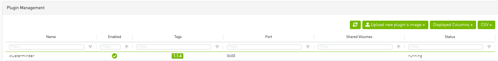
After successfully loading the plugin image, the plugin should become visible within the plugins management table within the UFM GUI. To initiate the plugin’s execution, simply right-click on the respective in the table.
-
ClusterMinder Plugin UI
After the successful deployment of the plugin, a new item is shown in the UFM side menu for the ClusterMinder plugin
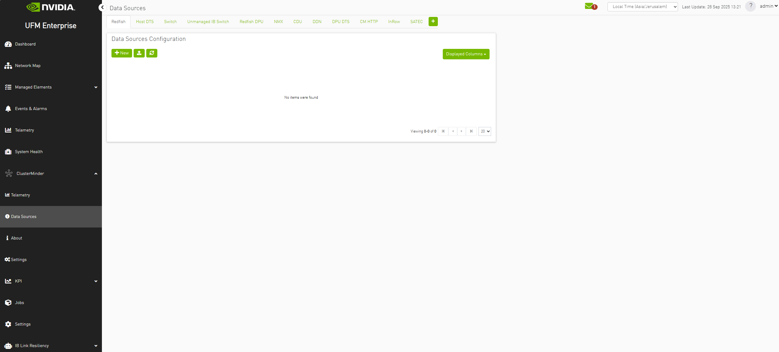
Data Sources Page
Managing data sources with ClusterMinder is intuitive and efficient. Users can easily add new data sources, update existing ones, or remove those that are no longer needed. This feature ensures your data is always current and relevant.
Example of Adding Data Source
Adding hosts is done through the "Data Sources" section. To add a data source, you start by selecting the appropriate tab, clicking 
Note: we support adding hosts in hostlist format for exmaple: agx[01-10].
for example:
Example of Adding a Redfish Host
After pressing the 

For example:
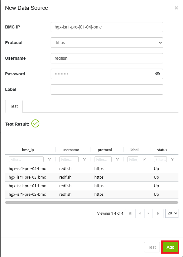
Note: when adding multiple redfish hosts, they should all be of the same model and vendor. If this is not done it can cause issues with data collection and presentation.
Example of Adding a Switch Host
After pressing the
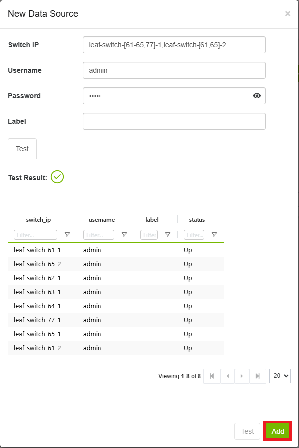
Note: when adding multiple switch hosts, they should all be of the same OS type. If this is not done it can cause issues with data collection and presentation.
Example of Adding a User Generated Data Source Type
Pressing the 
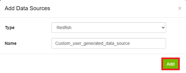
Type dropdown has "Redfish","Switch","Host DTS", "CM Http". These are the currently supported data types. Requires a page refresh to appear in the sidebar.
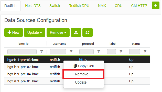
Example of Removing Data Source Endpoint
Removing hosts is done through the "Data Sources" section. here you can right click any available host and click the remove option.
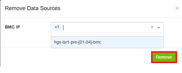
You can also use the 
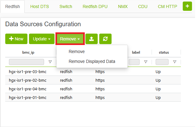
to open the Remove Data Sources form that has the IP field. After choosing the appropriate IP you can click the 
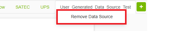
Removing User Generated Data Source Type
Removing user generated data source type is done through the "Data Sources" section. here you can right click any user generated data source type and click the remove option.
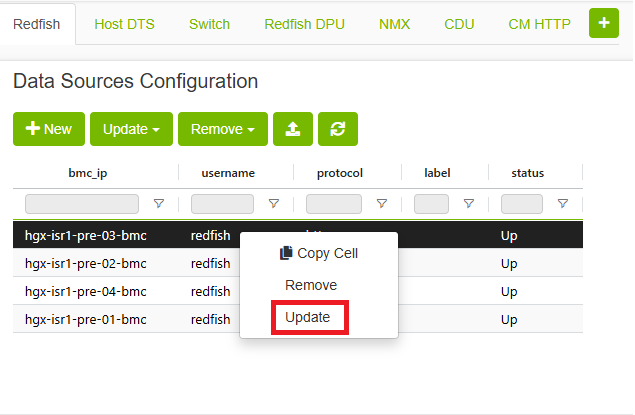
Example of Updating Data Source Endpoint
Updating hosts is done through the "Data Sources" section. here you can right click any available host and click the update option.
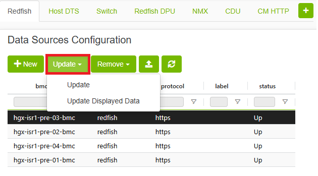
You can also use the 
Explorer Page
Data Tab
The Data tab provides a comprehensive view of all your data in one place, organized in an easy-to-navigate tree or table view. Additionally, there is a group view tab that allows users to see differences in host groups, helping to identify and understand misconfigurations within their data. This feature allows users to quickly access and navigate through their data, making it easier to perform analyses and derive insights. Users can right click tree APIs to copy API path or content or add to filter preset
Redfish Data Example

Switch Data Example

Additional Features
Filter Bar
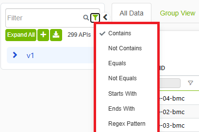
The filter allows to choose specific API based on frequency level. The search box allows to search for substring in the API or a specific data field use the control next to the search box to pick how the text is matched—for example contains, does not contain, equals, regex, and other comparison modes. You can also choose to only show APIs with a minimum or maximum number of groups
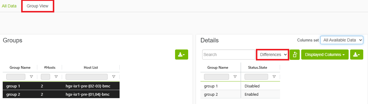
Group View
The group view inner tab allows to view endpoints divided to groups based on differences in data.
Ignoring fields when computing differences
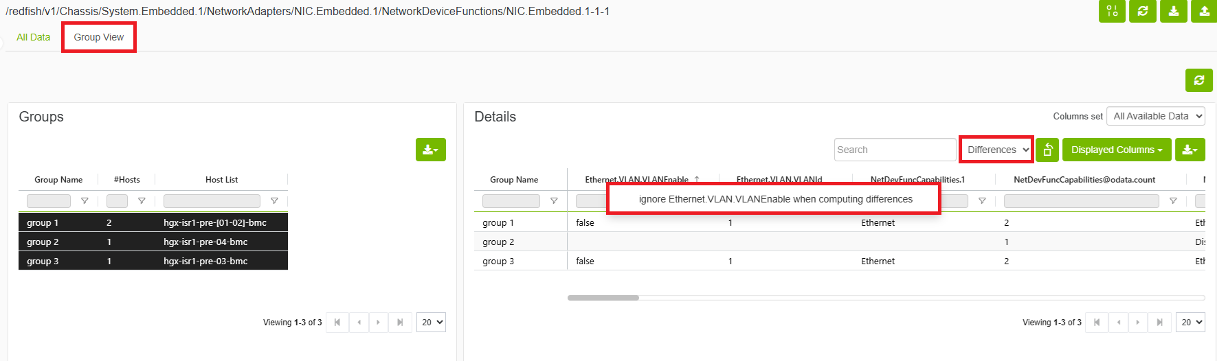
Allows users to ignore certain fields when computing differences by right clicking field name and choosing ignore.
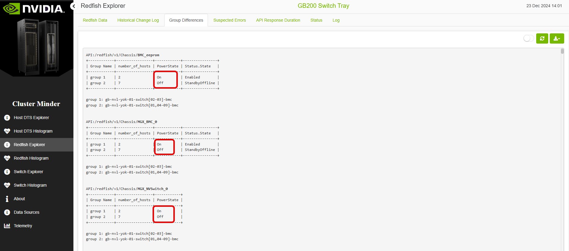
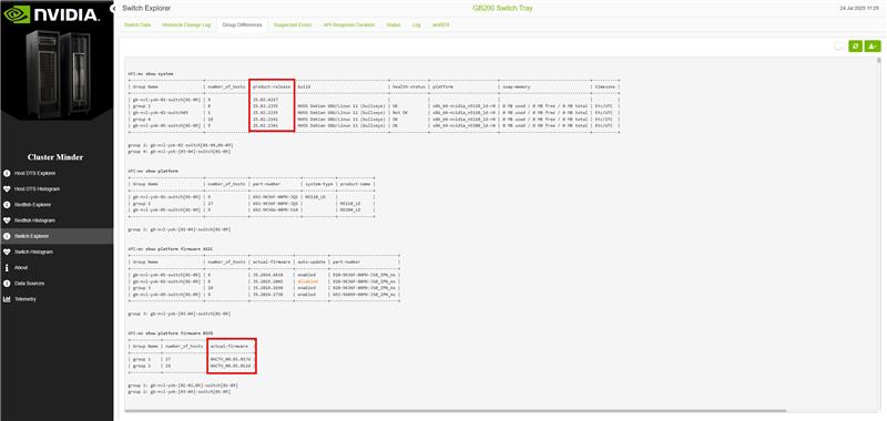
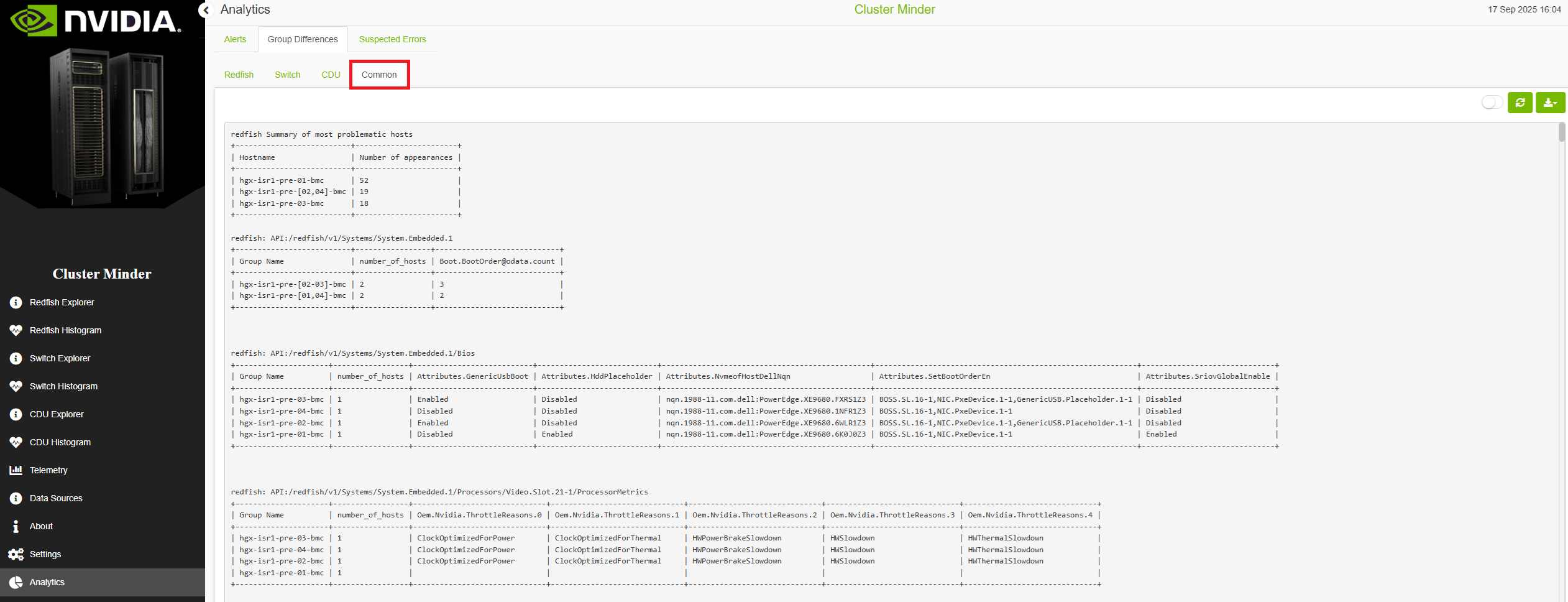
Group Differences Tab
The “Group differences” tab helps users identify and understand misconfigurations within their data. By comparing different data groups, users can easily spot discrepancies and take corrective actions. At the start of the report, there is a summary table that lists the most problematic hosts in descending order based on the number of appearances. This table provides a quick overview of the hosts that require the most attention, allowing users to prioritize their troubleshooting efforts effectively. Additionally, each table in the report (besides the summary table) includes the API that provided the data, a column for the number of hosts per group, and the fields where their values differed, ensuring transparency and traceability of the information presented.
There is a switch button that enables component view.
Redfish Group Differences Example
Switch Group Differences Example
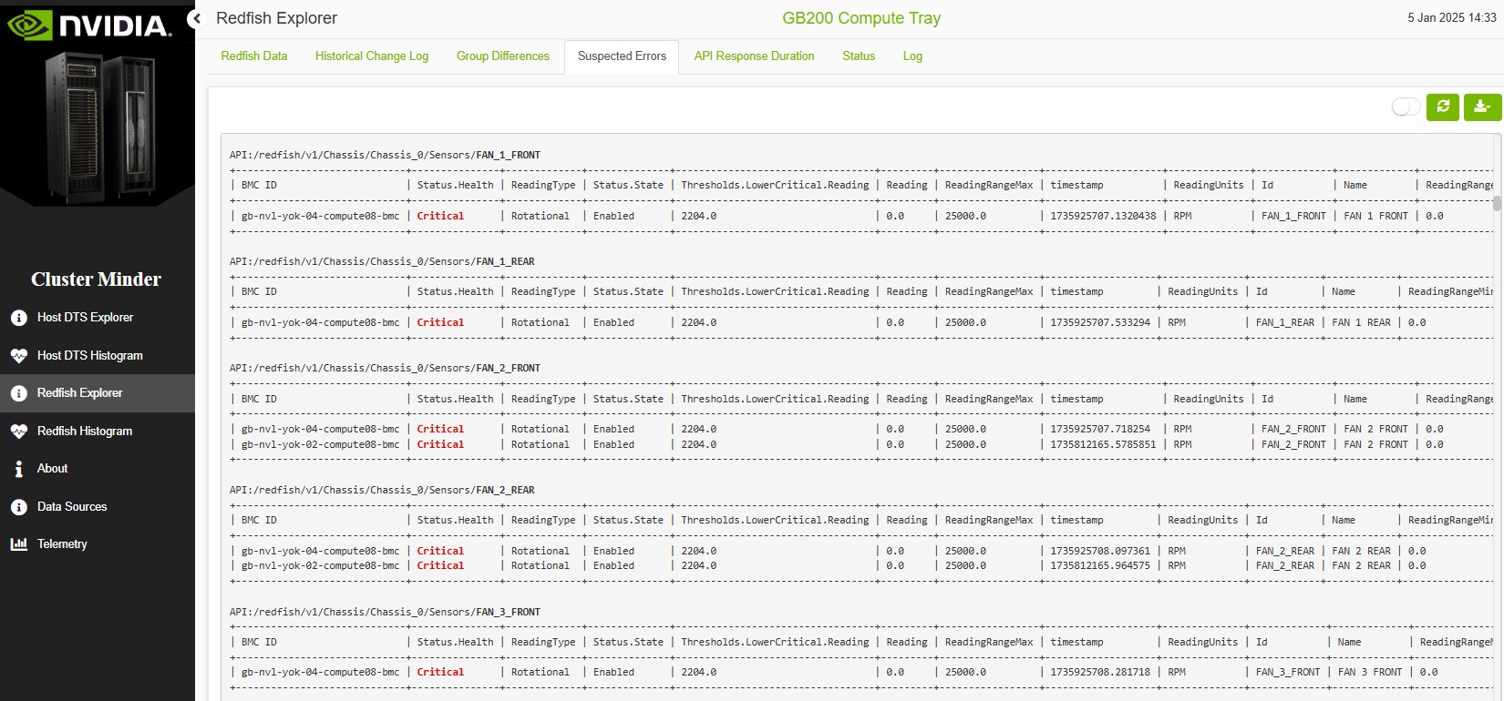
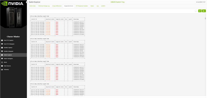
Suspected Errors Tab
The “Suspected Errors” tab provides a comprehensive report on APIs that have returned values flagged as potential issues. This report is crucial for maintaining the reliability and integrity of your data analysis. At the start of the report, a summary table lists the number of hosts with errors compared to the total number of hosts, giving users a quick snapshot of the overall health of their data environment. This summary helps prioritize troubleshooting efforts and allocate resources effectively. Each entry in the report details the host ID, the specific fields where values were problematic, and the problematic values themselves. These values are highlighted in red or orange to indicate the severity of the issue, with red denoting more critical problems and orange indicating less severe ones. This color-coding allows users to quickly assess the urgency of each issue and take appropriate corrective actions.
There is a switch button that enables component view
Redfish Suspected Errors Example
Switch Suspected Errors Example
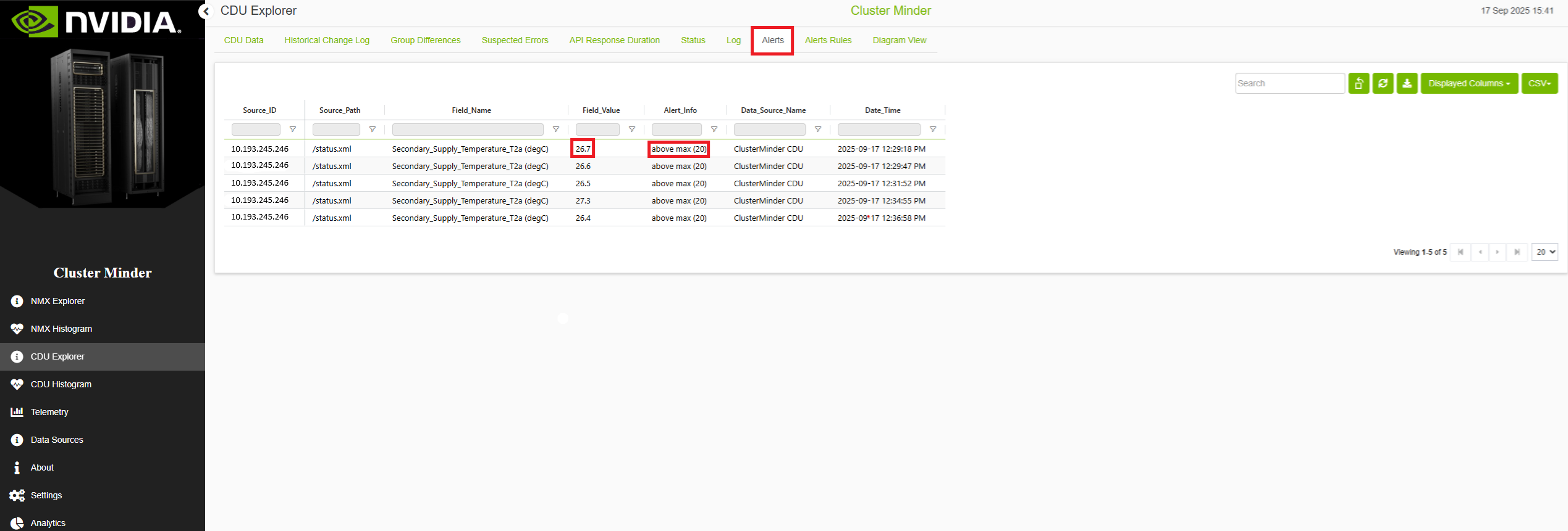
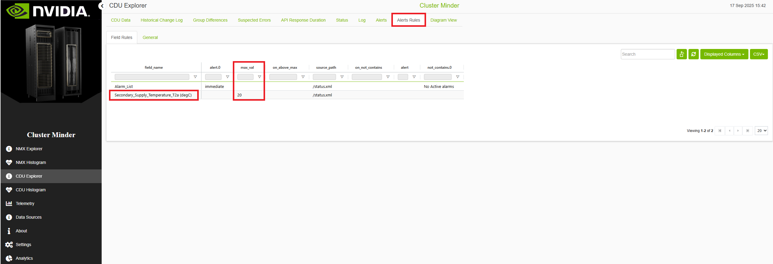
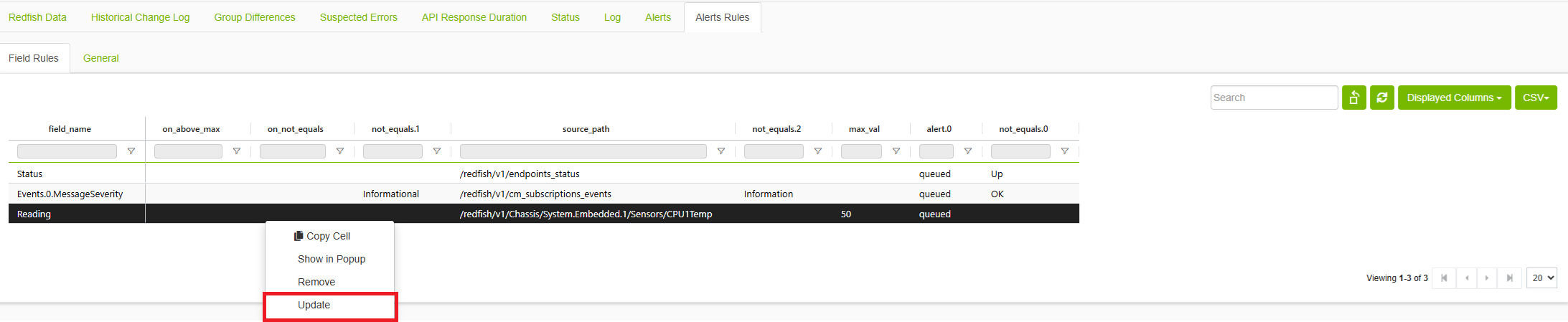
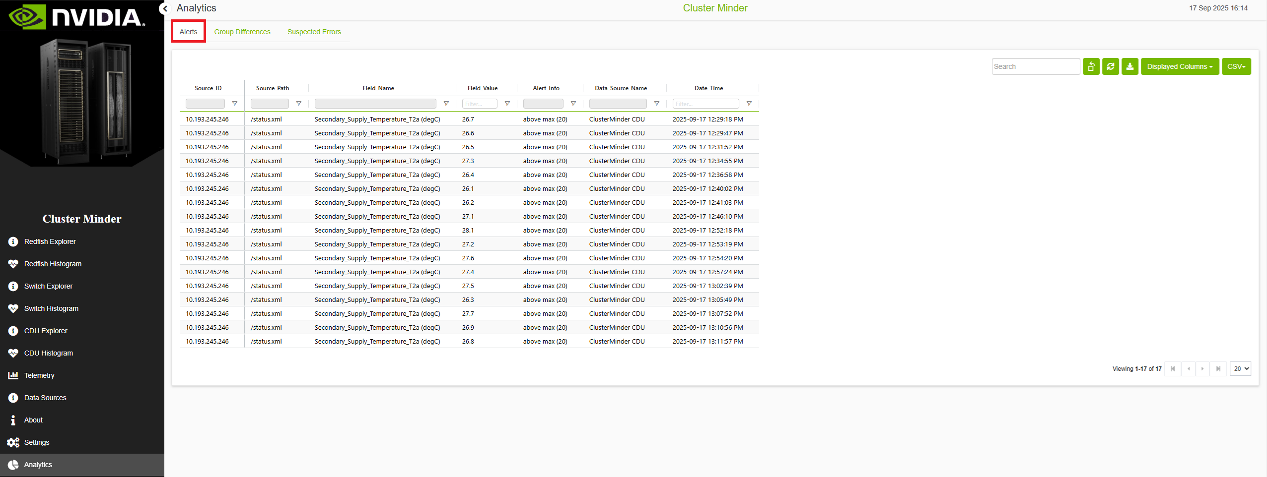
Alerts and Alerts Rules Tab
The Alert tab displays all fields whose values meet or violate specific thresholds defined by the user. The Alert Rules tab provides an overview of all the rules the user has created. The Alert Rules tab provides an overview of all the rules the user has created. Alert condition "contains" and "not contains" support regex format. By default, an alert monitors and logs endpoint status changes (between 'Up' and 'Failed to connect' states)
Updating alerts
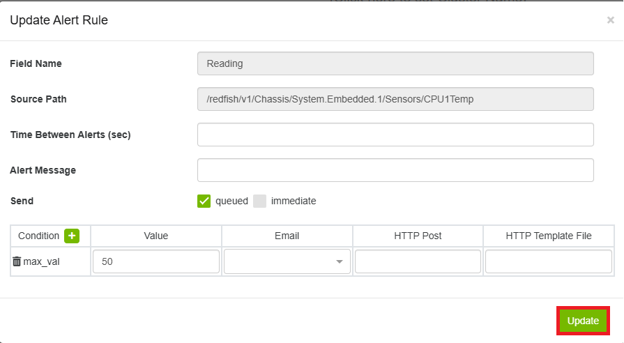
Right clicking any alert rule, selecting update allows to modify the following parameters:
-
Field name and source path to monitor
-
Threshold conditions (equals, not equals, contains, etc.)
-
Alert actions (immediate, queued)
-
Email notifications and frequency settings
-
Slack notifications via incoming webhook
-
Slack notifications via Slack bot
-
Minimum time between alerts
clicking "Update" will save the changes made.
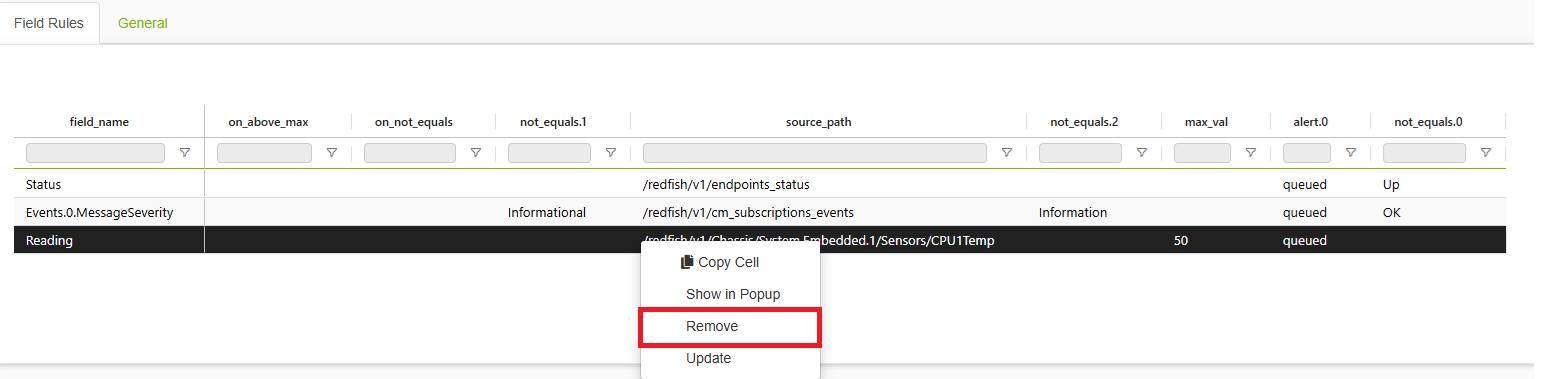
Removing alerts rule
To remove an alert rule from the Alerts Rules tab: Right-click on the alert rule you want to delete. Select "Remove" from the context menu. The alert rule will be deleted and the table will automatically refresh
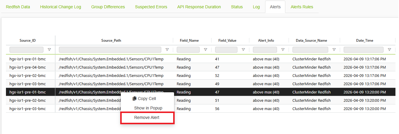
Removing alerts
To remove an alert from the alerts tab: Right-click the alert you want to remove. Select Remove Alert from the context menu. The alert will be removed and the table will automatically refresh.
Additional Features
Historical Change log Tab
Displays fields that have had their values changed, sorted by SRC ID and API.
API Response Duration Tab
Displays the duration of each APIs data collection.
Log Tab
The log page in Cluster Minder provides a comprehensive view of all product logging activities. This feature is essential for tracking changes, monitoring system performance, and diagnosing issues.
Histogram Page
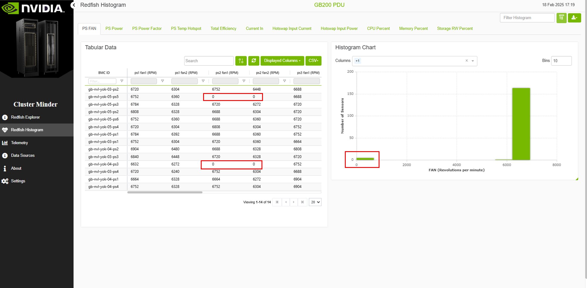
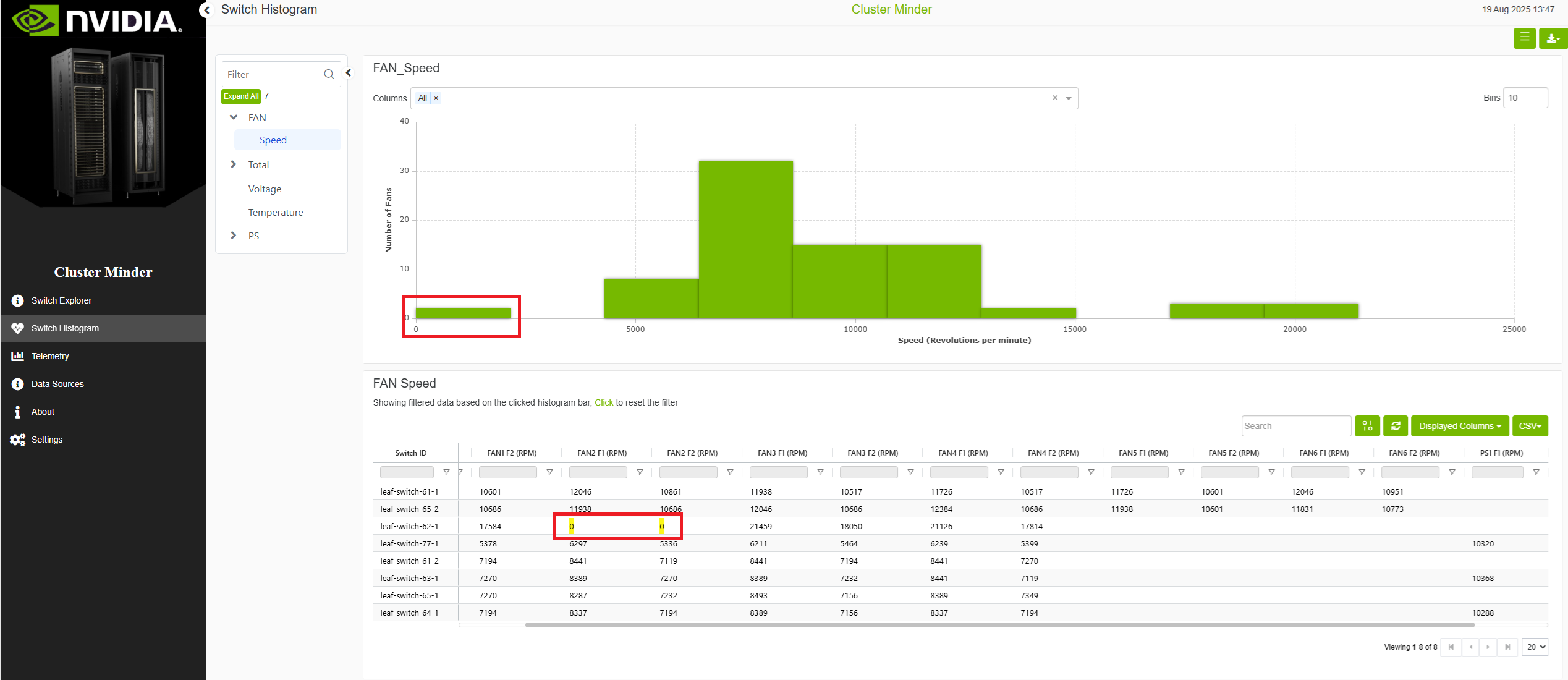
Visualizing data is simple with ClusterMinder’s histogram feature. Histograms are premade according to the type of data source and the make and model. They cover quantities such as RPM speeds, voltages, wattage, amperage, temperatures (Celsius), and more. By clicking the histograms, users can filter specific hosts or values for more targeted analysis. Using the dropdown menu, users can further narrow the histogram bars to focus on specific data subsets and attributes.
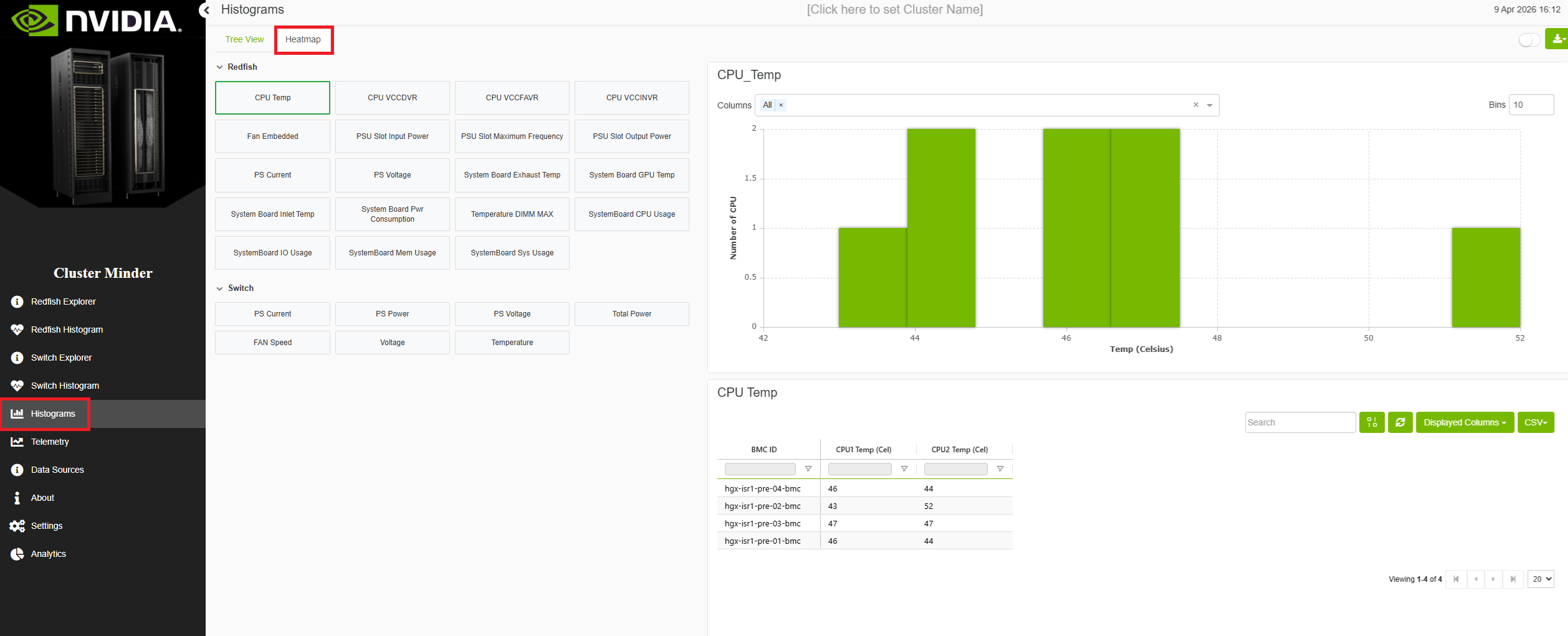
Each data module has its own histogram page with the relevant charts for that module. In addition, a Histograms page lists every available histogram in one place: charts are grouped under the module they belong to, so you can browse all histograms without switching modules.
On every histogram-related page—including each module’s histogram view and the aggregate Histograms page—a Heatmap tab is available. It presents the same histograms in a heatmap layout so you can compare patterns across metrics at a glance.
Redfish Histogram Example
Switch Histogram Example
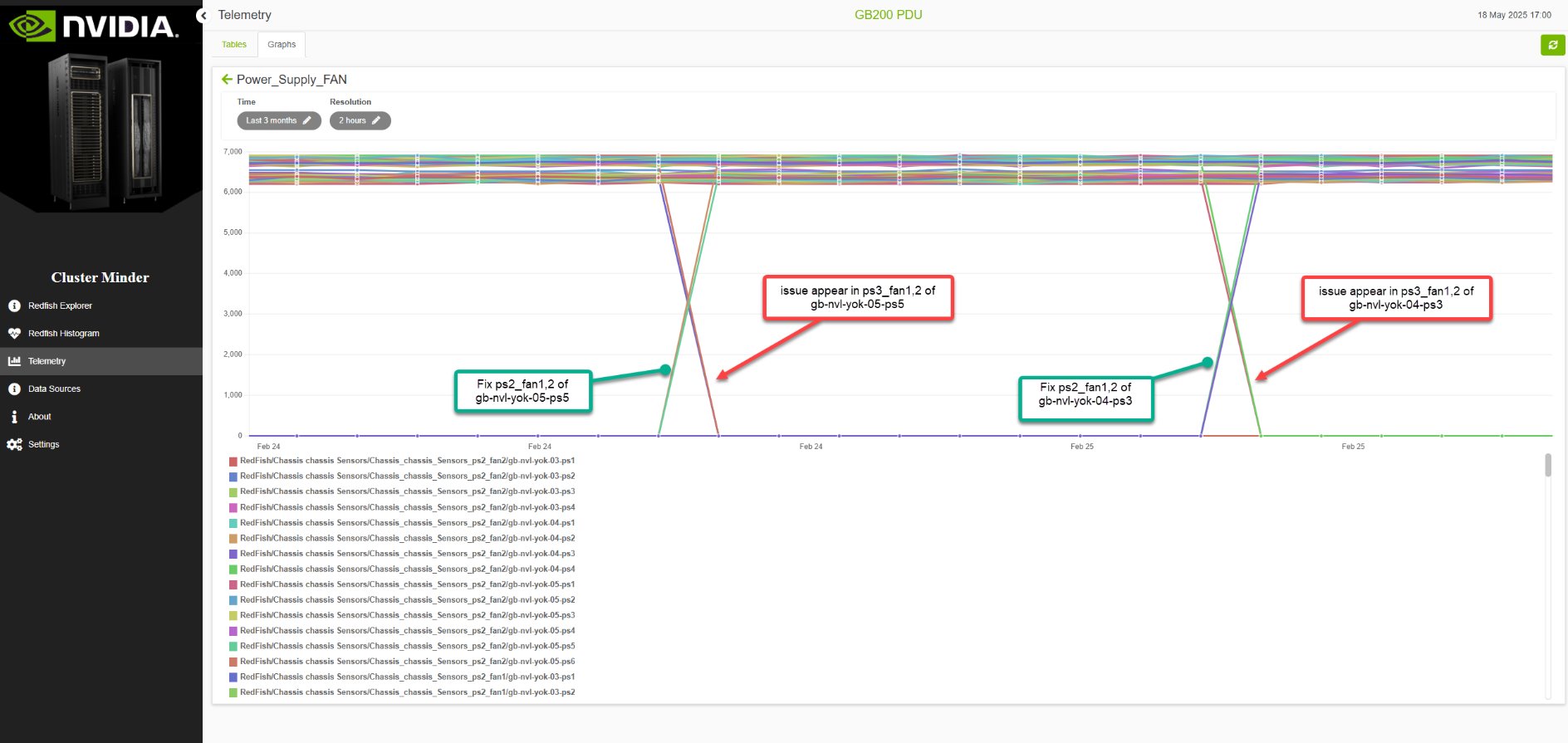
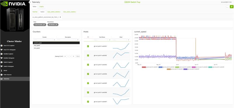
Telemetry Page
ClusterMinder’s telemetry page allows users to create custom graphs based on their data. Additionally, there are premade graphs available depending on the telemetry data the data source provides. This feature provides flexibility in how data is displayed and analyzed, enabling users to tailor their graphs to meet specific needs.
There is a switch button that enables tree view.
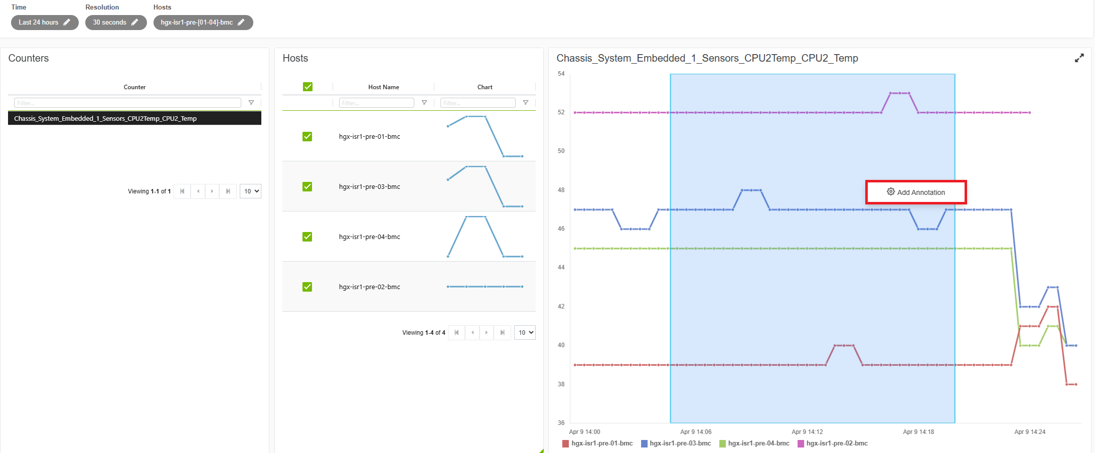
Redfish Telemetry Example
Switch Telemetry Example
Additional Features
Graphs Tab
Allows user to create a custom graph. To do so users should navigate to the “Graphs” tab. Here, they can press the 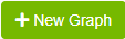
Dashboards
Dashboards in this project enable users to collect and organize specific graphs they create, grouping related visualizations within a single dashboard for easier access and comparison. This allows users to save sets of graphs that serve a common purpose and effortlessly switch between multiple dashboards to manage different groups of visualizations tailored to various needs.
Dashboard example
Annotations
The Annotation tab allows users to mark and document specific time periods in telemetry data for devices and metrics. Annotations provide context for unusual patterns, incidents, maintenance windows, or other events of interest in the monitoring data.
Users can upload a JSON file containing an array of annotation objects, where each annotation requires src_id, device, provider, metric, annotation_start_time, annotation_end_time, and notes fields, with optional start_time, end_time, and query_resolution fields for customizing the displayed data range.
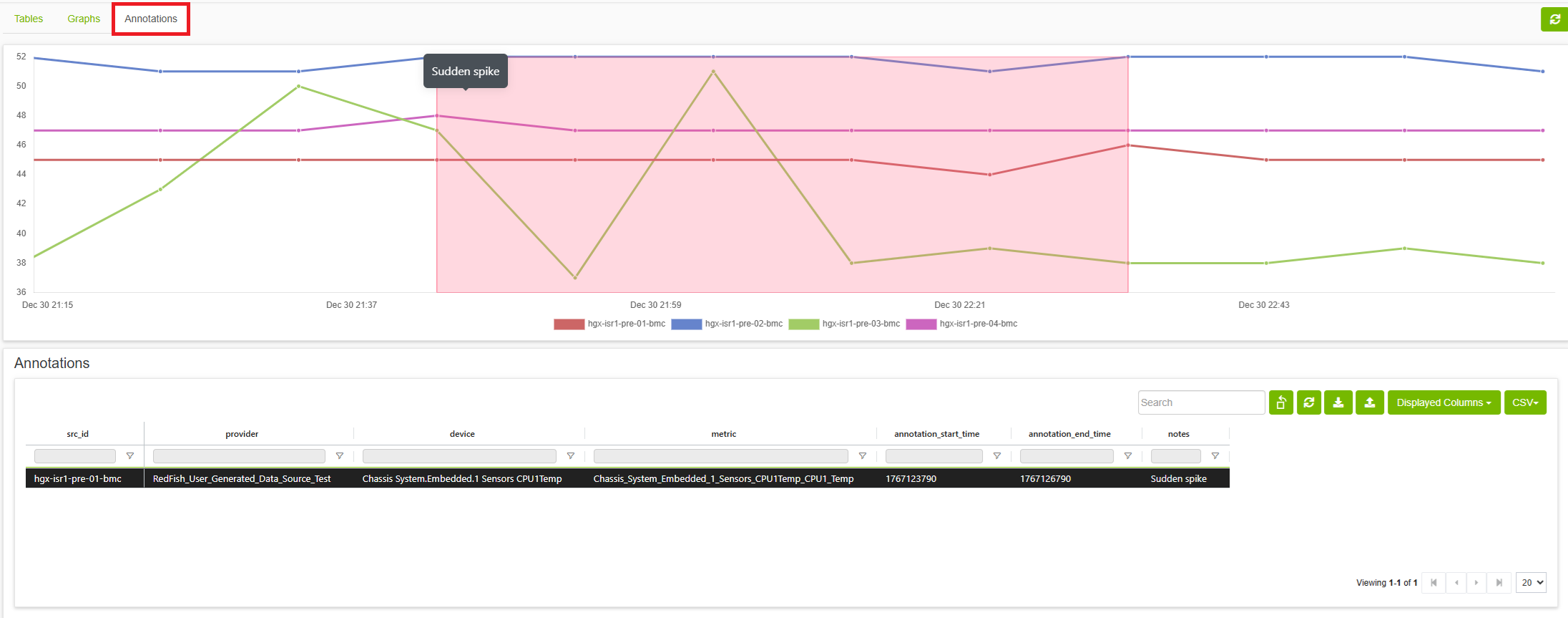
Users can also create annotations directly from a telemetry graph: hold Shift and drag on an existing graph to draw a time-range box. Right-click inside that box to add an annotation; the action uses the selected start and end time, query resolution, and hosts for the new annotation.
Icons
Analytics Page
ClusterMinder’s analytics page allows users to view suspected errors and group differences reports in one aggregated location as well as viewing common suspected errors and common group differences. Analytics page also provides alerts (currently only CDU supported) for various user determined scenarios. This page provides ease of use viewing of all the text reports in a singular location as well as important user tailored alerts.
There is a switch button that enables component view.
Last updated: